Kitchen Color Schemes 101
Welcome to the next post in our interior painting color series! Last time I talked about choosing an interior painting color palette. We covered the color wheel, analogous and complementary colors, and how different colors affect your mood. It’s worth a quick skim if you missed it.
Today we’ll focus on what color you should paint your kitchen. There’s no one perfect kitchen color, but some are better than others. (The short version: White, cream, and light citrus and blues work well; avoid navy, black, and bright yellow.) I’ll suggest a few kitchen color schemes based on what looks good as well as how the colors affect your mood.

Let’s start with three questions.
1. What Color Are You Working Around?
Most people have a dominant and/or neutral color in their kitchen. To figure out yours, look at your cabinets or flooring. (Or think about the new ones you’ve already chosen.) They’ll usually dictate the rest of your kitchen color scheme. If you’re still struggling, just look at the biggest surface in your kitchen.
2. Is Your Palette Warm or Cool?
Now that you’ve identified your kitchen’s dominant feature, determine if it’s more blue or red. For instance, if your cabinets are bright white (blue undertones), a cream-and-yellow color scheme will look off. You’ll want to use cooler hues like silver and black, with touches of something bright like red as an accent. Blues and greens are excellent choices as well.
If your cabinets or floors are a warm mahogany (red undertones), you’ll want to build a sunny color scheme. Pale banana yellow, burgundy, cherry tomato, and pumpkin are all strong choices. Cream, beige, and tan paint will look better than a chilly white. The same is true if copper, brass, or gold dominate your kitchen. Save cool tones for small accents.
3. What’s Your Color Trend or Scheme?
Now that you’ve figured out what your main color is, whether it’s warm or cool, and one or two possible coordinating colors, it’s time to figure out your overall color trend. The main three color trends popular today are pastels, brights, and monochromatic colors.
Pastels are calm, Easter-egg colors: light blue, chiffon yellow, and dusty lavender. (An extreme version is a baby nursery.) Brights are high-saturation hues that make an impression. Designers often use them in small doses or tone them down with neutrals. And monochromatic colors are all in the same family, just lighter and darker variations of each other.

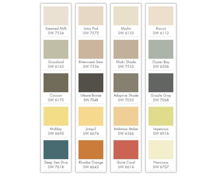
Source: CertaPro Painters using Sherwin-Williams colors
So if your cabinets are a creamy white and your floors are warm wood, you have several paint options for your color trend:
- Pastel: sunny yellow or coral
- Bright: tropical teal or a similar gemstone
- Monochromatic: tans that are a lighter tint of the flooring or a darker shade or tone than the cabinet
If you have a hard time choosing paint colors, you can return to complementary or analogous color schemes.
If you remember from last time, analogous color schemes use colors that are next to each other on the color wheel. They express “consistency and uniformity.” If you’re new to kitchen color schemes or feel overwhelmed, analogous colors are a safe choice.